The Meaning Behind the Masters Logo and the Detail Most Fans Overlook
via Usta
Bildnummer: 01513711 Datum: 07.04.2005 Copyright: imago/Icon SMI Fahne des Masters Turnier in Augusta - PUBLICATIONxINxGERxSUIxAUTxHUNxONLY (Icon5937621); Vdig, quer, Fahne, Fahnen, Flagge, Flaggen, Logo, Emblem, Turnierlogo, Turnieremblem, Masters 2005, PGA Tour, Golfen Augusta Golf Herren Einzel Einzelbild Randmotiv Objekte Logo
Every April, patrons walk into Augusta National Golf Club and spend without hesitation. Hundreds of dollars in the Golf Shop is routine, and for some, it goes past a thousand. The logo on those items carries weight, and that weight is part of the appeal.
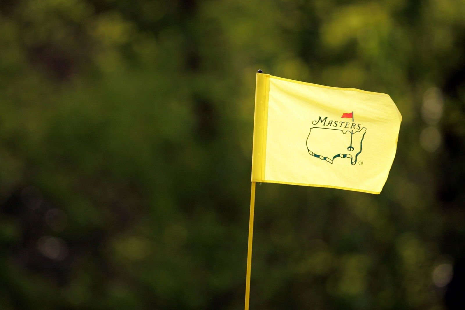
The Augusta National emblem, first used in 1934 when the event was still the Augusta National Invitation Tournament, shows a yellow outline of the United States with a red flag planted over Georgia.
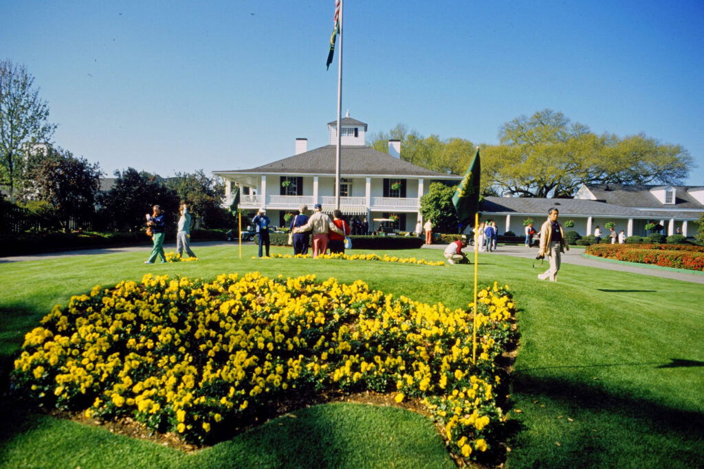
It appears on Green Jacket buttons, merchandise, podiums, and even the flowerbed at Founders Circle outside the clubhouse. Co-founder Clifford Roberts once described it as looking like “an ancient drawing.”
via Usta
The Masters Golf Tournament at Augusta National Golf Club - Clubhaus mit Blumenlogo The Masters Golf Tournament Clubhaus mit Blumenlogo ARCHIV FOTO ACHTUNG AUFNAHMEDATUM GESCHÄTZT Augusta Georgia UnitedmStates The Masters at Augusta National Golf Club *** The Masters Golf Tournament at Augusta National Golf Club Clubhouse with floral logo The Masters Golf Tournament Clubhouse with floral logo ARCHIVE PHOTO ATTENTION UPDATE DATED Augusta Georgia UnitedmStates The Masters at Augusta National Golf Club
That description fits more than intended. Because the map is not accurate.
Florida drops straight down instead of angling toward the Caribbean. New England’s coastline is smoothed out to the point it barely resembles a real map.
Older Green Jacket patches showed the Great Lakes clearly, a detail that is not there in the newer designs. It was just an approximation that was never fixed.
And yet, that imperfection is part of what stuck. The logo is not treated like a map, but as a symbol.
Augusta National did not refine the logo over time. It locked it down.
How Augusta National Turned an Imperfect Map into the Most Legally Protected Masters Logo in Golf
The club has enforced control over its use, sending cease-and-desist letters to apparel brands, golf courses, and amateur groups that tried to replicate elements tied to the Masters.
The message has stayed consistent: no reinterpretations, no close copies, no borrowing.
Talamore Golf Resort's llama-themed logo with a flagstick rising from the animal’s chest and one leg extended outward was redesigned in green and yellow. The resemblance was enough.
The club chose not to challenge it, and the cease-and-desist letter now hangs in the Talamore clubhouse.
The approach is not just limited to physical merchandise. It has progressed as a trademark dispute in digital spaces too, including video game companies.
The cleanest version of the logo which includes the map and flag with no text, is not always publicly available. Some variations are reserved for members, reinforcing the exclusivity tied to the club.
What defines the Masters is not perfection, and neither is its logo. The iconic map contains design flaws that have never been corrected.
Yet it remains one of the most protected and recognizable symbols in golf.
Did you know the Masters logo has geographical errors on it? If you have, let us know in the comments.
Read more at Daily Club Golf!
Written by

Sneha Abraham
Edited by

Pulkit Prabhav